
Overview
iChai is a mobile app designed to help users discover nearby independent cafés that serve high-quality chai. It prioritizes authenticity, flavor detail, and intentional selection over convenience.
The goal was to improve café discovery while reducing decision friction through structured information and clear navigation.
Role: UX/UI Designer
Tools: Adobe XD, Freepik
Problem / Need
Chai enthusiasts struggle to identify high-quality, authentic options. Existing tools prioritize location, not quality, making it difficult to evaluate cafés before visiting. This creates decision fatigue and inconsistent experiences. The core challenge was balancing minimalism with enough information to support confident decisions.
Key Insights
1. Users prioritize quality and authenticity over convenience
2. Decision friction stems from lack of meaningful detail (e.g., flavor, preparation)
3. Over-simplification removes necessary context and harms usability
4. Discovery is experiential, not purely functional
Design Process
I began by creating Avery Patel, a specialty beverage enthusiast who values authenticity, flavor transparency, and intentional purchasing decisions. Her behaviors directly influenced the app’s filtering system, café discovery flow, and information hierarchy.
To reduce decision friction, I designed a streamlined user flow:
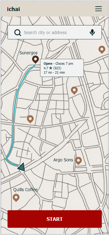
Home → Discovery → Café Detail → Navigation
Each screen was intentionally built around a single task to prevent unnecessary cognitive load.
Key Decisions
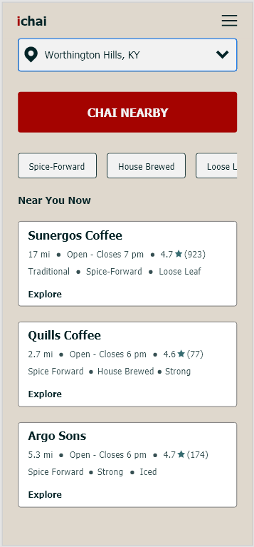
- A prominent “Chai Nearby” CTA anchors the experience and immediately guides users into discovery
- Location context is surfaced early to support faster decision-making
- Filter chips allow users to quickly refine results based on preferences such as spice profile, brewing style, and drink type
- Café cards prioritize key decision-making information, including flavor notes, preparation style, and availability
Iteration
- Refined layouts through professor feedback and self-evaluation
- Shifted fully to a flat design system to improve clarity and consistency
- Standardized spacing and hierarchy using a grid system to create a cleaner, more predictable interface
Final Solution
A clean, structured interface that supports fast, informed decisions.
Key Features
- Location-based discovery of independent cafés
- Curated café cards with tasting notes and preparation details
- Filter system aligned to user preferences
- One-tap transition from discovery to navigation
Visual System
- Flat design with high contrast and minimal elements
- Warm, earthy palette inspired by chai ingredients
- Clear typographic hierarchy and grid-based layout
The design directly reflects user needs identified in the persona, emphasizing intentional selection and efficient navigation.
Outcome & Reflection
Outcomes (Projected)
- Reduced decision time through structured information
- Improved discovery of high-quality local cafés
- Increased confidence in user choices
What Worked
- Strong alignment between user needs and interface structure
- Clear hierarchy anchored by a single primary action
- Effective balance between simplicity and functionality
Next Steps
- Conduct usability testing to validate task flow
- Measure task completion time and decision accuracy
- Expand personalization and filtering